A Deep-Dive into Designing a Website for a Betrayal Trauma Therapist
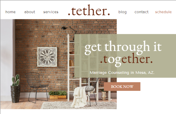
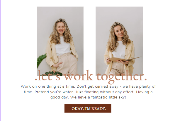
I’m so excited to showcase my latest project, Face the Storm Counseling, where I had the privilege of working with a talented therapist who specializes in betrayal trauma. For this design, I used my “Tether” website template—coming this December!—and customized it to bring her unique branding and message to life. (While originally a five page website, we condensed it to one page.)
Designing a website for a therapist is about more than just pretty colors and organized pages; it’s about creating a safe, trustworthy space for potential clients who are often taking their first steps toward healing. And when that therapist specializes in betrayal trauma, every detail matters even more. This project allowed me to dive deep into the nuances of branding, layout, and messaging that make a website truly resonate.
What Makes a Good Therapist Website?
In my work, I’ve found that a standout therapist website is more than a digital brochure—it’s a welcoming “space” for clients. Here’s what I believe makes a therapist’s website really work:
- A Message that Speaks Directly to the Audience
Good therapy websites know exactly who they’re for. They communicate understanding and compassion in a way that feels personal, even though it’s online. For Face the Storm Counseling, we focused on creating a message that wasn’t just supportive but strengthening, speaking to clients who are dealing with betrayal trauma. We wanted clients to feel like they could take that first step and face the storm—hence the powerful messaging on the homepage. - Branding that Reflects the Therapist’s Approach
Branding is the heartbeat of any website, but it’s especially crucial for therapists. The right colors, fonts, and images set the tone, showing clients what they can expect. The branding we used for Face the Storm Counseling features calming colors and nature-inspired visuals to create a grounded, supportive feeling. We wanted visitors to feel understood and empowered as they explored the site, reflecting the therapist’s approach to care and healing. - Intuitive, Client-Friendly Navigation
A good website helps clients easily find what they’re looking for, whether it’s information about services or a contact form to book an appointment. In this case, we focused on simple, straightforward navigation, with quick links to all the key sections like “About,” “Services,” and “Contact.” The goal was to keep everything accessible and easy to navigate, making the entire experience user-friendly from start to finish. - SEO Optimized for Visibility
For any therapist website, SEO plays a big role in helping clients find the practice. While aesthetics are key, we also implemented strategic SEO elements throughout the site to improve searchability, targeting specific phrases like “betrayal trauma therapist.” This helps potential clients connect with her services right from the search page.
Customizing the “Tether” Template for Face the Storm Counseling
With the base of my “Tether” template, we began crafting a site that would both honor her existing brand and offer a welcoming experience to those seeking help with betrayal trauma.

- Colors and Fonts
Her branding already had a foundation in calm, grounded colors, so we expanded on that with earthy greens, calming colors, and natural hues. The fonts were chosen to feel warm and inviting but also professional—elements that are essential in creating a safe space. We customized the font pairings to maintain that balance of approachability and credibility, using modern, clean typography that speaks of strength and support. - Messaging and Tone
Since betrayal trauma can be an incredibly sensitive and complex topic, the language on the site needed to be clear, empathetic, and empowering. We worked together to craft messaging that not only validated the client’s experience but also conveyed hope and resilience. Phrases like “Face the Storm” anchor the reader in the therapist’s specialized approach, providing reassurance and direction. - Visual Elements
Using the calming visuals inspired by nature, we designed the site to feel like a retreat, a place of solace where visitors could feel understood. I added gentle, organic shapes and backgrounds, hinting at growth and healing, mirroring the journey that the therapist guides her clients through. - Calls to Action
Knowing that potential clients might feel hesitant or unsure about reaching out, I would’ve liked to place more gentle, welcoming calls to action throughout the site. CTA’s that aren’t pushy or sales-y; instead, they invite clients to “Take the Next Step” or “Begin Your Journey.” This time around, I feel like we didn’t accomplish that due to third-party integrations. Although, the contact form is easy to find and we highlighted client-first options for reaching out.

Final Thoughts
This project reminded me of the incredible power that a well-designed website can have in helping clients take that vital first step toward healing. Each element—from the branding to the content to the colors—was chosen with the goal of making clients feel safe, understood, and ready to connect. Face the Storm Counseling is a perfect example of how the right website can extend the therapist’s space beyond the office walls, giving clients a place to feel welcome, validated, and empowered even before they’ve made their first appointment.
If you’re ready to bring a similar transformation to your practice, stay tuned! My Tether template will be available this December and is designed to bring clarity, strength, and connection to any therapy website.